Making the Perfect Match: Understanding the Correlation Coefficient Without Getting Burned
What do campfires and statistics have in common? 🔥 More than you might think.
Teaching the correlation coefficient can feel like striking a match—sometimes students see the relationship immediately, and sometimes it takes a few tries before the spark appears. The correlation coefficient, usually written as r, helps students measure how strongly two variables are related in a linear way.
In this lesson, we explore how students can visually interpret correlation, distinguish between strong and weak relationships, and connect scatter plots to correlation values without getting lost in formulas. With engaging analogies, real-world connections, and a hands-on matching activity, students learn to recognize when two variables truly “match”—and when the data just won’t light.
Making Sense of the Numbers: Teacher Tips for Tackling Data and Statistics
Statistics doesn’t have to make your students’ eyes glaze over! From quirky correlations to eye-opening visualizations, data can tell fascinating stories—if you know how to guide your class through it. In this blog, we explore practical, teacher-tested strategies for making statistics fun, approachable, and deeply meaningful. Learn how to turn scatterplots into stories, box plots into comparisons, and data into discovery. Whether you’re tackling mean, median, and mode or diving into standard deviation and normal distributions, these tips will help your students see that math is more than numbers—it’s the key to understanding the world around them.
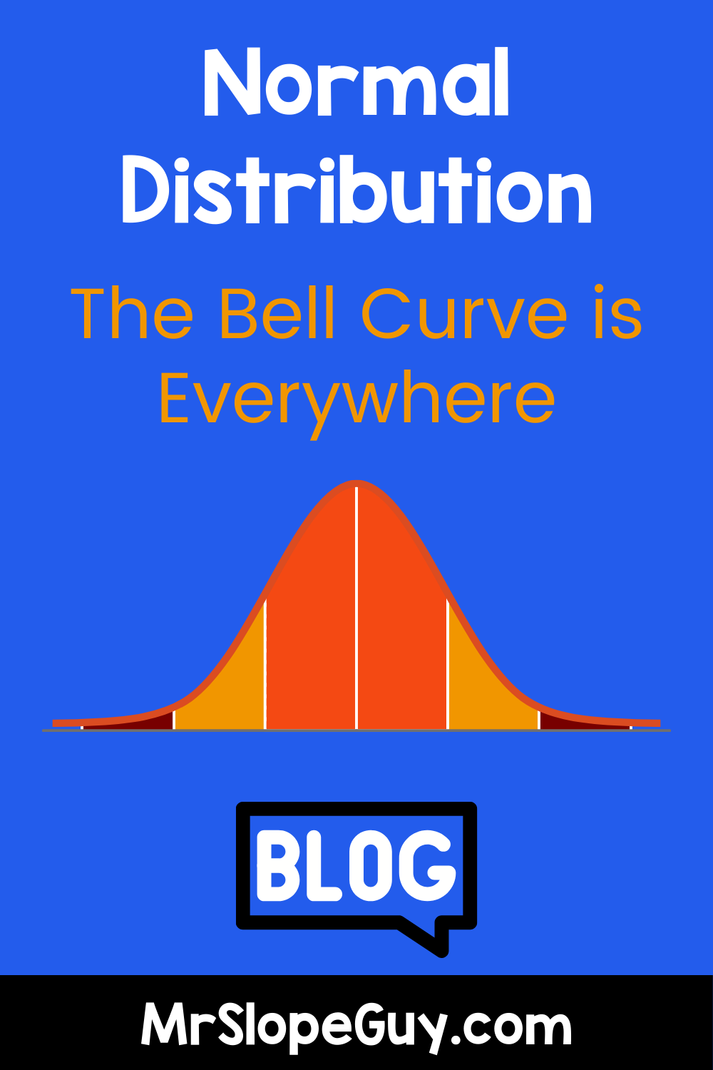
Normal Distribution in Statistics: Why the Bell Curve is Everywhere
Ever wonder why so many real-world data sets—like test scores, heights, and IQs—seem to follow the same smooth curve? That’s the power of normal distribution in action. In this post, we break down what makes the bell curve so special, explore why it keeps popping up in real life, and offer fun, classroom-friendly ways to teach it using real data, predictions, and engaging activities. Whether you're a teacher or a curious learner, this is your guide to understanding the shape that defines so much of the statistical world.
Teaching Standard Deviation with Real Data: From Sports Stats to Science
Standard deviation doesn’t have to be a scary math concept! By using real-world examples—like bowling scores, baseball stats, and science experiments—students can see how standard deviation measures consistency vs. variability. Whether analyzing player performance, experimental data, or test scores, this concept plays a crucial role in making data-driven decisions. Get ready for a fun, engaging lesson that brings math to life!
Residual Plots: A Powerful Tool for Data Analysis in Math Class
Residual plots are a game-changer for teaching data analysis in math class! These visual tools help students evaluate the accuracy of regression models, revealing hidden patterns and strengthening their statistical reasoning. By integrating engaging activities and real-world applications, educators can transform residual plots from an abstract concept into a powerful skill for data-driven decision-making.
Eyeballing the Line of Best Fit: Building Estimation Skills in Math Class
Teaching students to estimate the line of best fit bridges the gap between intuitive data analysis and formal statistical tools. This blog explores engaging strategies for building estimation skills, addressing common misconceptions, and making math lessons more interactive and fun with real-world data.
Using Box Plots to Hit Home Runs in Math: A Teacher's Guide to the "Box and Whisker" Plot
Box plots, also known as "box-and-whisker plots," are a fantastic tool for visualizing data and understanding statistics. This guide explores their history, explains their role in teaching math, and uses baseball stats as a real-world example to bring this concept to life. Learn how to teach box plots effectively and help students hit a home run in their data analysis skills!
Visualizing Data: The Importance of Stem-and-Leaf Plots in Math Education
Did you know that the humble stem-and-leaf plot, created by statistician John Tukey in the 1970s, is a math classroom superstar? This tool bridges the gap between raw data and deeper statistical analysis, helping students understand data distributions while keeping the original values intact. Discover how stem-and-leaf plots build foundational skills, simplify comparisons, and make data visualization engaging and relatable for today’s learners.
Understanding Correlation vs. Causation: Lessons from a Bumbling Detective
Help your students understand the difference between correlation and causation through the hilarious escapades of a bumbling detective! Explore how his misinterpretations of clues provide valuable lessons on these essential concepts in statistics and critical thinking.
The Importance of Teaching Two-Way Tables and Relative Frequency Tables in Mathematics
In the diverse landscape of mathematics education, certain concepts serve as cornerstones for developing students' analytical and interpretive skills. Two-way tables and relative frequency tables are among these essential tools. Although they might seem like straightforward data organization techniques, their value extends far beyond the basics. In this blog, we’ll explore why teaching two-way tables and relative frequency tables is crucial for students, highlighting their real-world applications and their role in fostering statistical literacy.


