Making Sense of the Numbers: Teacher Tips for Tackling Data and Statistics
If there’s one unit that can make even confident math teachers sweat a little, it’s statistics. Between histograms, box plots, correlation coefficients, and the ever-confusing “correlation vs. causation” discussion, teaching data can feel like roller skating in a buffalo herd.
But here’s the thing — once students start to see the stories behind the numbers, statistics becomes one of the most engaging topics in math class. It’s not just numbers and formulas — it’s detective work! From comparing test scores to predicting the next viral TikTok trend, statistics is how students make sense of their world.
So, let’s dive into some teacher-tested tips for helping middle and high school students not only understand data but actually enjoy it.
1. Start with Stories, Not Numbers
Before diving into histograms and box plots, start with questions students care about:
“Do taller students really have bigger shoe sizes?”
“Does studying longer actually improve your grade?”
“Is there a link between hours of screen time and hours of sleep?”
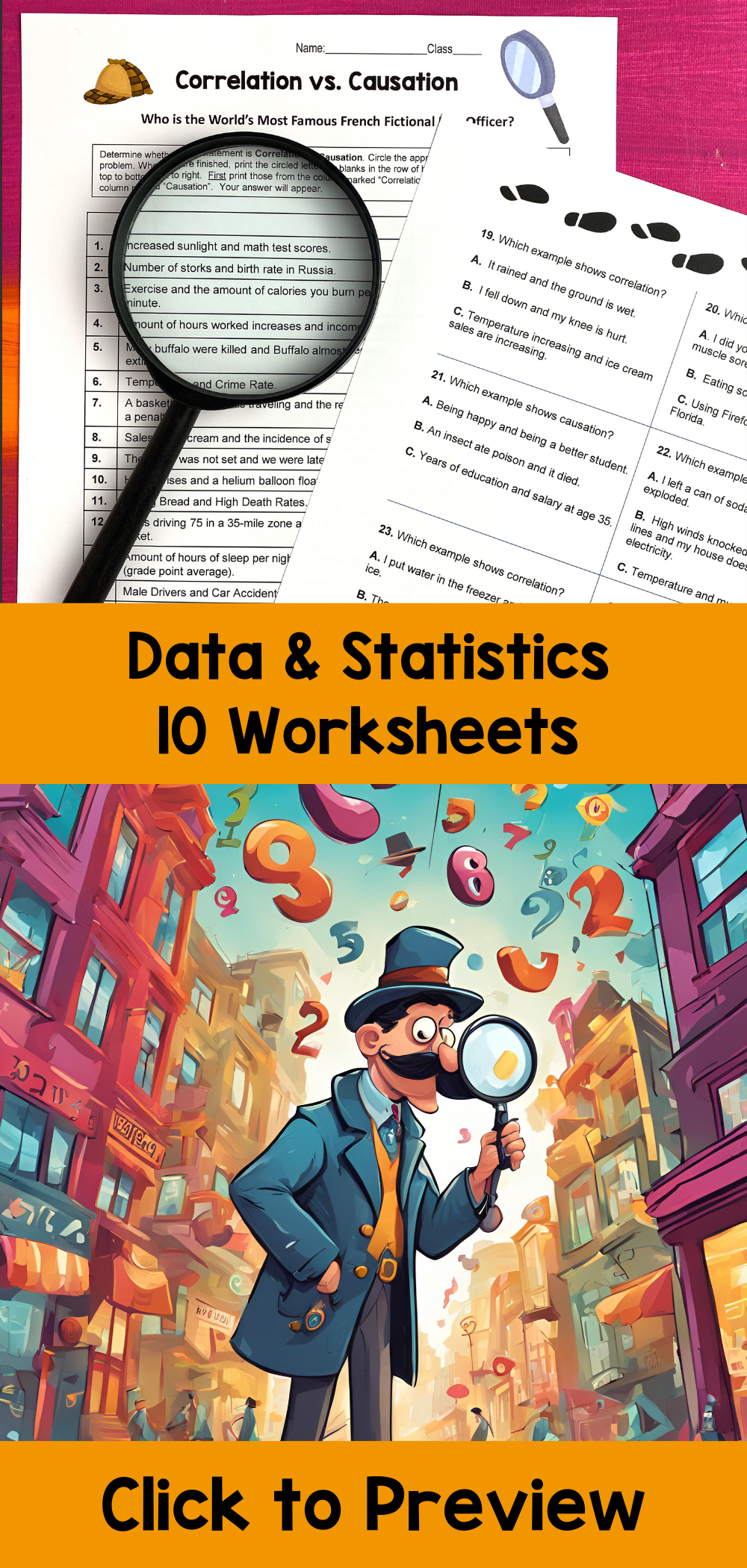
These questions spark curiosity and set the stage for correlation versus causation, one of the trickiest — but most important — concepts in data literacy. Let students collect their own data first; then show how correlation does not always mean one thing causes another. (Just because the number of ice cream sales rises when shark attacks increase doesn’t mean dessert is dangerous!)
2. Comparing Measures of Central Tendency: The Great Debate
When students calculate mean, median, and mode, they often assume they’ll all be the same. That’s when you hit them with a skewed data set — like incomes in a town with one billionaire. Suddenly, the mean soars, and students begin to see why statisticians use multiple measures of central tendency to describe data accurately.
Try a class activity where students create their own data sets to “trick” the mean or median. This gets them thinking critically and builds intuition for how data can be represented (and misrepresented).
3. Get Visual: Histograms, Box Plots, and Stem-and-Leaf Plots
Data visualization is where students either fall in love with statistics or get completely lost. The secret? Show them how each graph tells a story.
Histograms help students see how data clusters — great for understanding distributions and frequency.
Box plots summarize the big picture — perfect for comparing multiple data sets at once.
Stem-and-leaf plots are like training wheels for histograms, helping students transition from raw data to grouped data.
Have students create all three representations for the same data set, then discuss what each one highlights. It’s a great way to reinforce that how we visualize data changes what we notice about it.
4. Correlation Coefficients: Measuring Relationships (Without the Drama)
When you introduce the correlation coefficient, students can get overwhelmed by formulas and decimals. Keep it intuitive:
+1 means a strong positive relationship (like hours studied and grades).
–1 means a strong negative one (like hours on social media and hours of sleep).
0 means no correlation at all (like shoe size and math ability — sorry, big-footed friends).
Turn it into a matching activity — show scatterplots and have students estimate the correlation coefficient. They’ll be amazed at how quickly their “data sense” develops.
5. Describing Distributions & Standard Deviation: Spread the Knowledge
Students love comparing data sets, but they often overlook the spread. Enter standard deviation — the unsung hero of data analysis.
Explain it like this: if two classes have the same average test score, but one has scores all over the place while the other is tightly grouped, the spread tells us more than the mean does.
Show visual examples with bell curves and have students guess which class has the greater deviation. It’s an easy way to make the concept stick.
6. Normal Distributions and the Empirical Rule: Predicting the “Normal”
Introduce the Empirical Rule (68-95-99.7) like it’s a magic trick: “About 68% of the data falls within one standard deviation, 95% within two, and 99.7% within three.”
Then challenge students to predict outcomes — like how many students in the school are likely between certain heights or how many test scores fall within a range.
Connecting this to real-world data — sports stats, heights, or even video game reaction times — helps students see that “normal” isn’t just a math word; it’s a pattern found all around us.
7. Circle Graphs: Bringing Data Full Circle
Circle graphs (or pie charts) are visual favorites, but they can also be misleading if the sections aren’t scaled correctly. Let students create their own using data they collect in class — like favorite snacks, music genres, or after-school activities.
Then have them compare their pie charts to bar graphs to discuss which is easier to interpret and why.
8. Making Data Meaningful
The ultimate goal is for students to interpret data, not just calculate it.
Encourage them to explain what graphs show in words, write short “data stories,” and critique how statistics are used in media headlines. This builds mathematical reasoning and critical thinking — essential skills in today’s data-driven world.
9. Teaching Tip: Build Gradually Like a Staircase
Start simple and stack the concepts:
Begin with collecting and organizing data.
Move to measures of center and spread.
Add graphical representations (stem plots → histograms → box plots).
Finish with correlation, causation, and interpretation.
By layering learning in stages, students gain confidence and see how all the pieces connect.
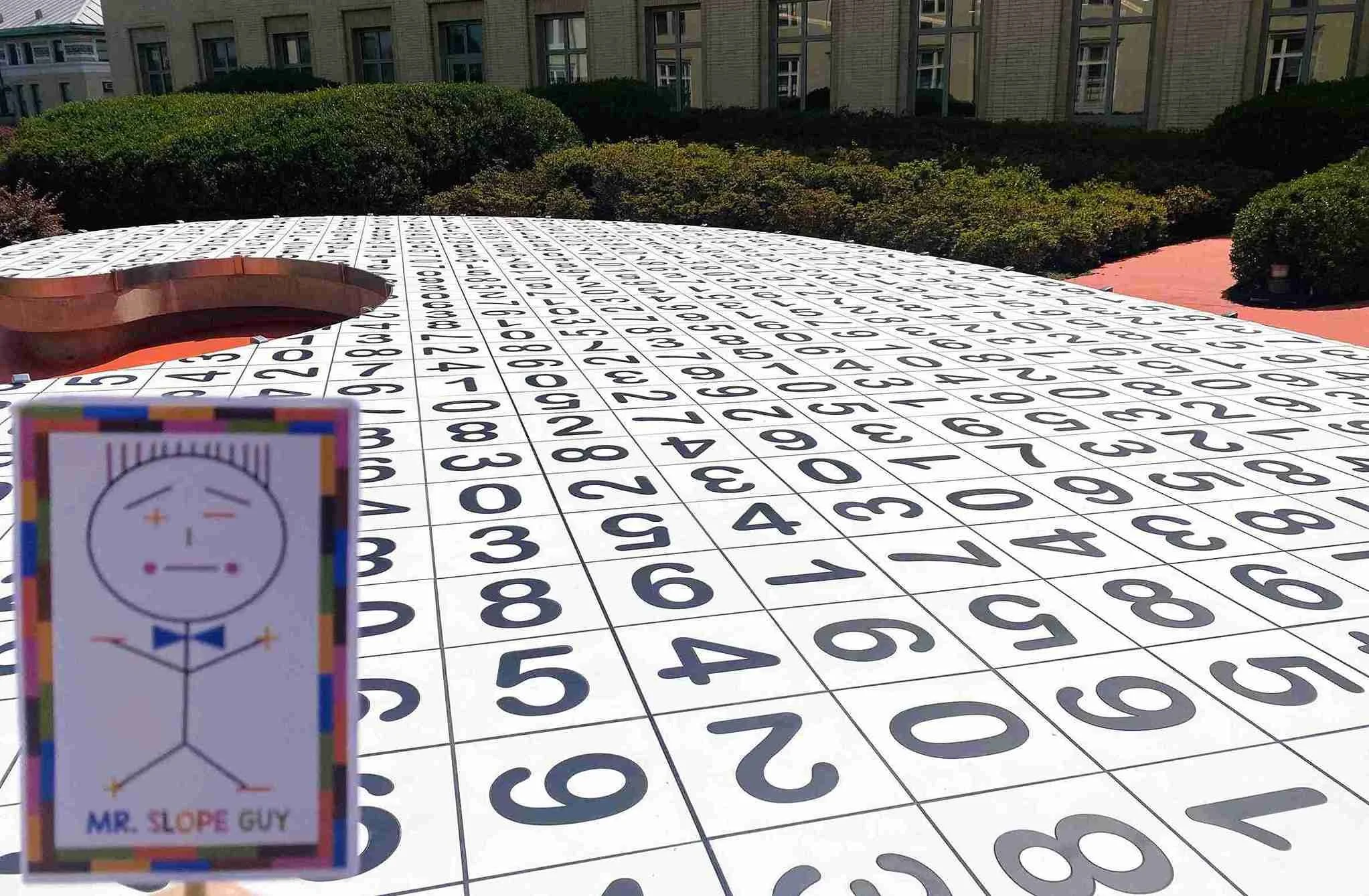
Mr. Slope Guy exploring the “Garden for Math Nerds” in Pittsburgh, Pennsylvania — surrounded by a sea of numbers, proving that in math, growth comes from data, not dirt!
Ready to Bring Data to Life in Your Classroom?
If you want to make your statistics unit smooth, engaging, and no-prep, check out my Data and Statistics Worksheets Bundle!
This collection includes hands-on worksheets covering:
✅ Correlation vs. Causation
✅ Mean, Median, Mode Comparisons
✅ Stem-and-Leaf & Box Plots
✅ Standard Deviation & Normal Distributions
✅ Circle Graphs, Histograms, and more!
Each activity is designed for middle school and high school students, scaffolding learning from simple concepts to complex interpretations. Whether you’re reviewing or introducing new material, these ready-to-print resources make teaching data-driven lessons easier and more meaningful.