Normal Distribution in Statistics: Why the Bell Curve is Everywhere
If you’ve ever looked at test scores, height measurements, or even IQ scores, you’ve probably seen the bell curve in action. The normal distribution is one of the most important concepts in statistics, and once students understand it, they begin to see patterns everywhere. But teaching normal distribution isn’t just about drawing a smooth curve—it’s about helping students understand why this shape keeps appearing in real-world data.
What is Normal Distribution?
Normal distribution statistics describe data that clusters around a central value, forming a symmetric, bell-shaped curve. The highest point of the curve represents the mean (or average), and the spread of the data is measured by standard deviation.
A perfectly normal distribution follows these general rules:
About 68% of the data falls within one standard deviation of the mean.
About 95% of the data falls within two standard deviations of the mean.
About 99.7% of the data falls within three standard deviations of the mean.
This is often called the 68-95-99.7 rule (or the empirical rule), and it helps students visualize how data is distributed.
Why is the Bell Curve Everywhere?
The normal distribution appears naturally in so many areas because many real-world measurements are influenced by multiple small, independent factors. Here are some common examples:
Height of People – If you measured the height of every student in a school, most students would be close to the average, with fewer very tall or very short individuals.
Test Scores – Whether it’s SAT, ACT, or IQ scores, student performance tends to follow a normal distribution because many factors (study habits, test-taking skills, prior knowledge) contribute to the final score.
Measurement Errors – In science and engineering, small errors in measurement often follow a normal distribution.
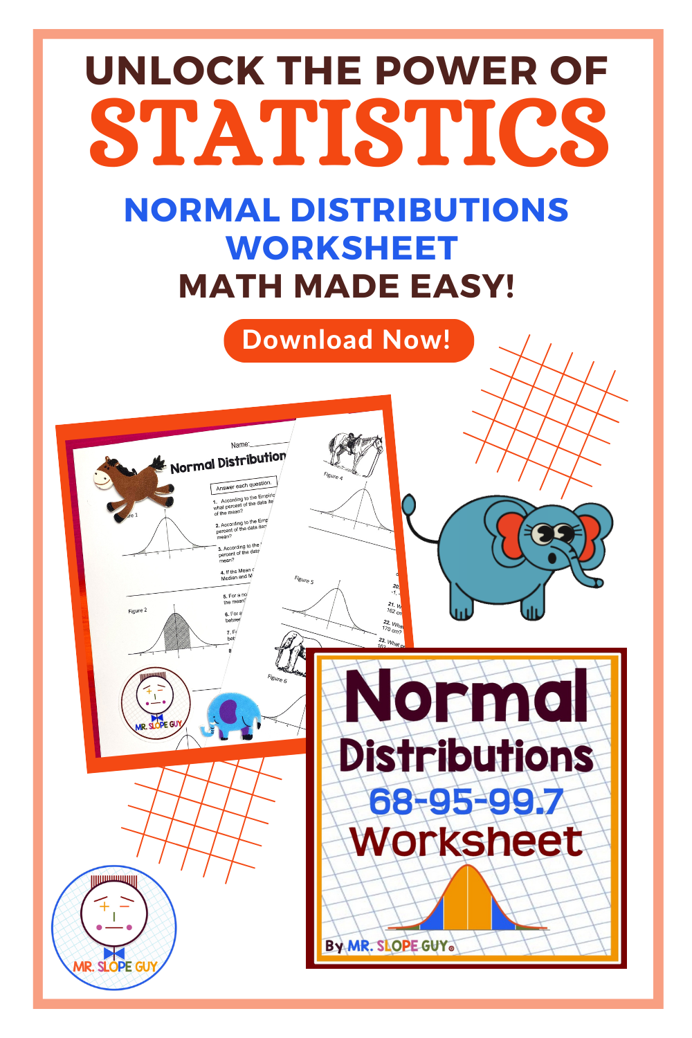
Mr. Slope Guy hangs out with a giant pink elephant in sunglasses in Clarksville, TN—because nothing says normal distribution like an unexpected dose of awesome! 🐘😎 In this stats worksheet, students explore bell curves using real data on elephant gestation periods. When math meets mammals, learning sticks! 📊🔔
Teaching Normal Distribution in the Classroom
Start with Real Data – Bring in data sets for students to analyze. For example, use students' heights, shoe sizes, or even their times for running a lap around the track.
Draw a Bell Curve Together – Label the mean and show where the standard deviations fall. Discuss what it means for something to be within one, two, or three standard deviations of the mean.
Make Predictions – Ask students questions like:
“If the mean height is 5'6" with a standard deviation of 2 inches, what percentage of students are taller than 5'10"?”
“If test scores follow a normal distribution with a mean of 75 and a standard deviation of 10, how many students scored above 85?”
Compare Skewed vs. Normal Data – Show examples of skewed data (like income distribution) and discuss why some data sets don’t follow the bell curve.
Why Teaching Normal Distribution Matters
Understanding normal distribution helps students with more advanced topics like z-scores, hypothesis testing, and probability. It also improves their ability to interpret real-world data—whether they’re analyzing sports stats, stock market trends, or health studies.
So next time you discuss statistics with your students, remind them: the bell curve is everywhere! Helping them recognize normal distribution in real life will give them a new way to see the world through the lens of math.


