Making the Perfect Match: Understanding the Correlation Coefficient Without Getting Burned
Imagine trying to start a campfire. You strike a match… but nothing happens. Strike again—still nothing. Then suddenly, spark! 🔥
That moment when the flame catches is a perfect metaphor for teaching correlation.
In statistics, we’re also looking for a “match”—a relationship between two variables. Sometimes it’s strong, sometimes it’s weak, and sometimes… there’s no spark at all. That’s where the correlation coefficient comes in.
Let’s break it down in a way your students won’t forget.
🧠 Why We Need to “Check the Match”
Students often assume that if a graph looks like a line, it must be a strong relationship. But in math (and life), assumptions can lead us astray.
If we fit a linear model to data, we should always check whether that assumption makes sense.
After all, we don’t want to make a fool of the data—and we definitely don’t want the data to make a fool out of us.
The correlation coefficient helps us answer one key question:
👉 How well do these two variables match?
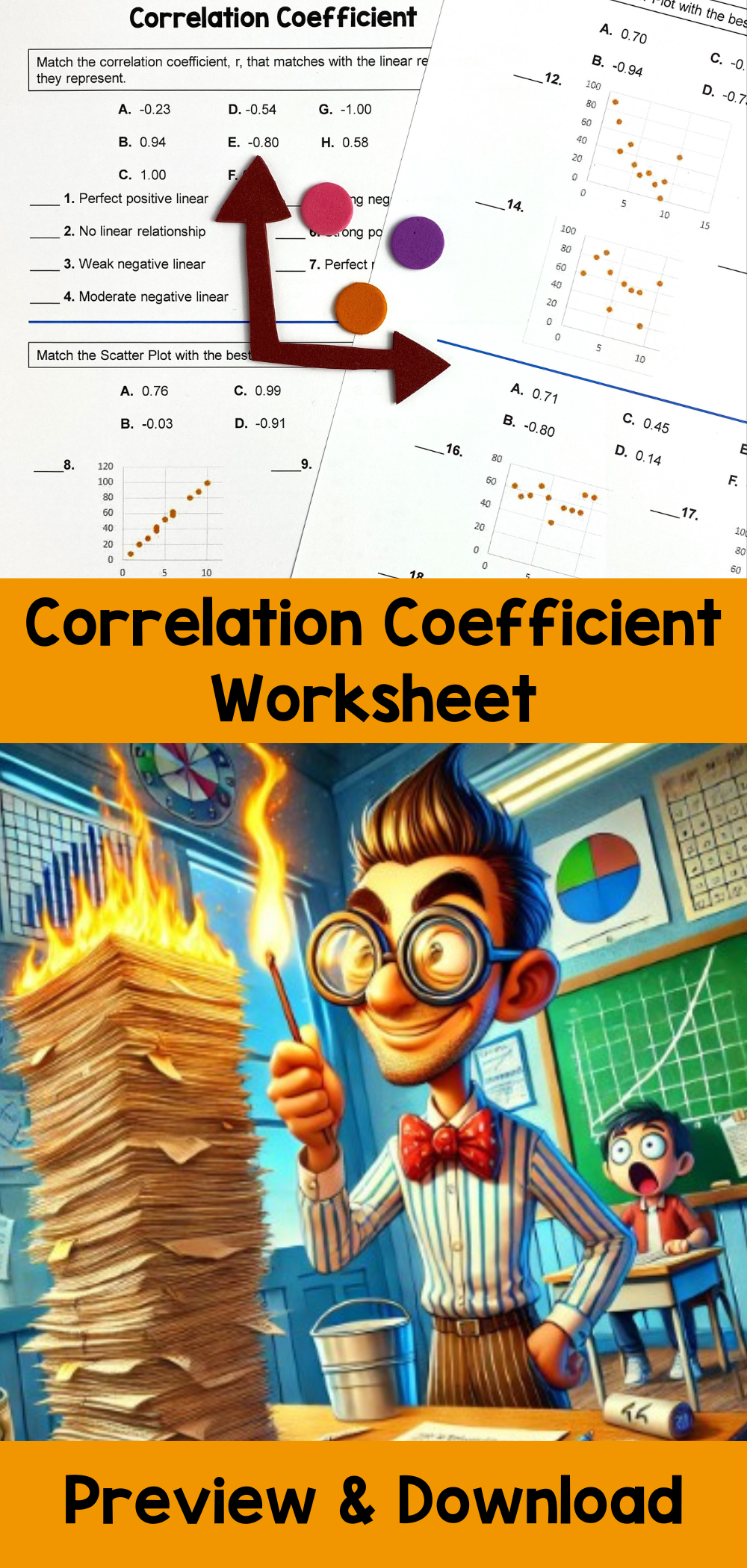
📊 What Is the Correlation Coefficient?
The correlation coefficient (usually called r) is a number that measures how strongly two variables are related in a linear way.
r = 1 → perfect positive match
r = -1 → perfect negative match
r = 0 → no match at all
Named after Karl Pearson—the “father of statistics”—this measure focuses on relationships, not calculations. In the classroom, the goal isn’t memorizing formulas. It’s understanding what the relationship actually means.
💪 Strong vs. Weak: The Weightlifting Test
Here’s a fun way to explain strength:
A strong correlation is like someone bench-pressing 300 pounds 💪
A weak correlation is like struggling with a tiny dumbbell 🏋️♂️
The closer r is to -1 or 1, the stronger the relationship.
The closer r is to 0, the weaker the connection.
This analogy helps students move beyond numbers and actually feel the meaning of correlation.
📈 Matching Graphs to Numbers: Where the Real Learning Happens
One of the biggest challenges students face is connecting graphs to correlation values.
They might ask:
“Is this graph positive or negative?”
“Is it strong or weak?”
“Does this look like r = 0.8 or r = 0.2?”
This is where matching activities become powerful.
Instead of just calculating r, students:
Compare scatter plots
Identify trends
Match graphs to correlation coefficients
Explain why a relationship is strong or weak
Suddenly, correlation isn’t just a formula—it’s a visual story.
🎯 Why This Skill Matters (Beyond the Math Classroom)
Understanding correlation helps students:
Interpret real-world data (sports stats, economics, social media trends)
Avoid confusing correlation with causation
Think critically about graphs they see in the news
Build a foundation for Algebra 2, statistics, and beyond
In other words, correlation is more than a topic—it’s a mindset.
🧩 Try This Engaging Matching Activity in Your Classroom
If you want students to truly understand correlation (not just survive the lesson), give them a hands-on way to make the match.
This resource does exactly that:
👉 <Estimating Correlation Coefficient Worksheet>
✅ Students match scatter plots with correlation coefficients (r-values)
✅ Identify positive vs. negative relationships
✅ Compare strong and weak correlations
✅ Build visual and conceptual understanding—not just computation
This two-sided worksheet is perfect for Algebra, Algebra 2, and Statistics classes and helps students confidently interpret data like real statisticians.