Histogram vs. Box Plot: When to Use Each for Describing Data
When it comes to visualizing data, two of the most commonly used graphs are histograms and box plots (also called box-and-whisker plots). While both are useful for summarizing data distributions, they serve different purposes. If you’ve ever wondered when to use a histogram vs. a box plot, this blog will help you understand their differences and how they describe data in unique ways.
Histograms: The Shape of the Data
A histogram is great for showing the distribution of numerical data. It groups data into intervals (or bins) and displays how often values fall within each range.
When to Use a Histogram
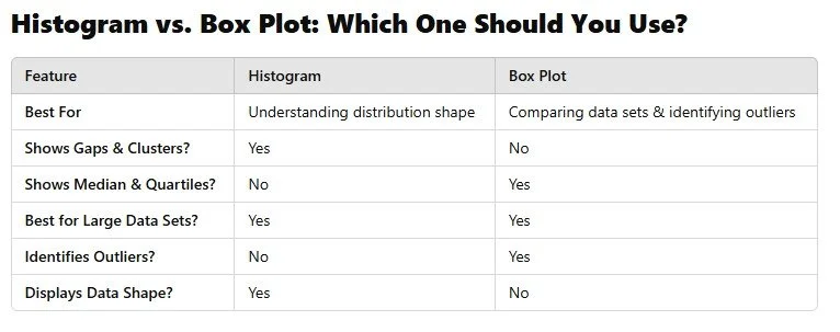
✔ Understanding the Shape of the Data – A histogram helps students see if data is skewed left, skewed right, or symmetric.
✔ Identifying Gaps & Clusters – If there are large gaps between bars, it shows missing values in certain ranges.
✔ Great for Larger Data Sets – With more values, a histogram provides a clearer picture of the data distribution.
Example: Exam Scores in a Math Class
Imagine you collect test scores from 100 students and create a histogram. You may see:
A bell-shaped curve if most students scored near the average.
A right-skewed histogram if a few students had very high scores, pulling the distribution to the right.
A left-skewed histogram if several students struggled with the test, pulling the distribution to the left.
What a Histogram Does Not Show Well
While histograms are great for distribution, they don’t provide precise measures of spread like quartiles or outliers. That’s where box plots come in!
Box Plots: Comparing and Summarizing Data
A box plot (box-and-whisker plot) focuses on showing the spread of data using the five-number summary:
Minimum
First quartile (Q1) – 25% of data is below this value
Median (Q2) – The middle value
Third quartile (Q3) – 75% of data is below this value
Maximum
Box plots also help identify outliers, which appear as individual points outside the whiskers.
When to Use a Box Plot
✔ Comparing Multiple Data Sets – Great for side-by-side comparisons (e.g., test scores of two different math classes).
✔ Identifying Outliers – Easily spot extreme values that may skew the data.
✔ Summarizing Data with Quartiles – Quickly see median, range, and interquartile range (IQR).
Example: Comparing Running Times of Two Groups
Say you time two different groups of students running a mile. A box plot allows you to:
Compare the medians of the two groups to see who, on average, ran faster.
See the spread (range) of times.
Identify outliers, such as a student who took much longer than the rest.
What a Box Plot Does Not Show Well
A box plot does not display the shape of the data (e.g., whether it is skewed left or right). While you can see symmetry from the quartiles, you won’t know if the distribution is bell-shaped or multimodal like a histogram would show.
Final Thoughts: Use Both for a Complete Picture!
Since histograms and box plots provide different insights, the best approach is to use both when analyzing data!
Start with a histogram to understand the distribution.
Use a box plot to compare multiple groups and identify outliers.
By teaching students when and why to use each, we help them become better at analyzing and interpreting data—an essential skill in math, science, and real-world problem-solving.